Before writing a 'style of X' prompt, decompose what X actually does on the canvas — Van Gogh, Klimt, Hopper
A counter-intuitive finding from building three artist-style prompt templates (Van Gogh / Klimt / Hopper): 80% of XX style prompts fail on the label. The word 'style' was never prompt content — it was a direction light.
I just shipped three artist-style templates into ImaRead's image prompt library: Van Gogh (vangogh-style), Klimt (klimt-style), Hopper (hopper-style). After all three, the counter-intuitive finding:
80% of people writing "XX style" prompts are fighting a fake problem — they think they're composing a style, but they're actually composing the parts of the painting nobody cares about.
Here's what "style" is actually getting between you and, and the specific actions each artist needs decomposed into the prompt.
1. Van Gogh (vangogh-style) — brushstroke direction and rotation
Template: vangogh-style. One line: the scene. Model renders.
Write "Van Gogh style" and you'll get a swirly, brushstroke-heavy, "kinda-like-it" image. Look again, and something is off.
The problem: Van Gogh's recognizability is not in subject matter. It's in the physical motion of his brushstrokes.
The Starry Night (1889) — the entire sky is a fluid field. Cypress trees twist upward like black flames. Stars are not points of light; they are centers of rotating vortices. Café Terrace at Night (1888) — the cobblestones are not flat. Each stone has its own rotational direction. The awning light radiates outward in thick arcs. Sunflowers (1888) — petals are impasto-thick, the yellow is a stack of lemon-to-ochre layers, not one color.
Action list to put in the prompt:
- Brushstrokes always have direction, swirling or flowing, never flat
- Complementary colors placed directly adjacent — yellow against purple, blue against orange, no gray transition
- Impasto thick enough to have physical depth
- Yellow is the signature — lamplight, starlight, wheat, sunflowers
"Style of Van Gogh" alone gives the model color, gives the model brushstroke feel, but not direction.
Direct link: www.ima-read.com/en/bycase?case=vangogh-style
2. Klimt (klimt-style) — gold zoning and pattern
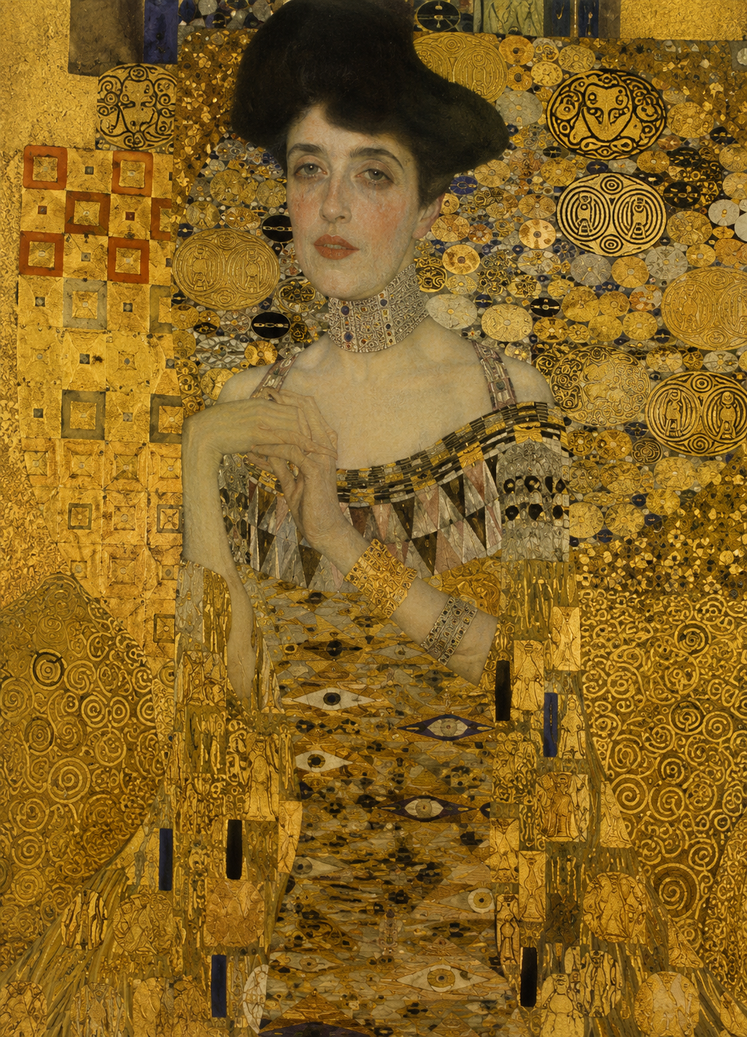
Template: klimt-style. One line: the scene. Model renders.
Write "style of Klimt" and you get a gold-filter image. The gold is there. What's missing is the layer Klimt was actually painting.
The problem: Klimt's signature is not the gold itself. It's how the gold is zoned, and what pattern each zone holds.
The Kiss (1907–1908) — two figures dissolve into a single field of gold. But look closer, the gold is not one block. The man's robe is black-and-white rectangles. The woman's dress is colored spirals and flower shapes. Two different pattern zones pressed together — that is the kiss.
Portrait of Adele Bloch-Bauer I (1907) is more precise. Adele's face and hands are naturalistic — skin, eyelashes, softness, all there. Below the neck, the body dissolves into gold tesserae. You cannot tell where the person ends and the decoration begins. The background is also gold, inlaid with rectangles and eye-shaped symbols. The painting has almost no depth — everything sits on one plane.
Action list to put in the prompt:
- Large gold-leaf texture — not gold paint; reflective, fragmented, layered foil
- Pattern zoning — clothing and background cut into regions, each with its own geometric motif
- Face naturalistic, body dissolving into ornament
- Flat composition, almost no perspective
- Intimate scale — figures fill the frame, no empty space, only fullness
Writing "gold" for Klimt is wasting gold. The real signature is how the gold gets partitioned, and what pattern each partition holds.
Direct link: www.ima-read.com/en/bycase?case=klimt-style
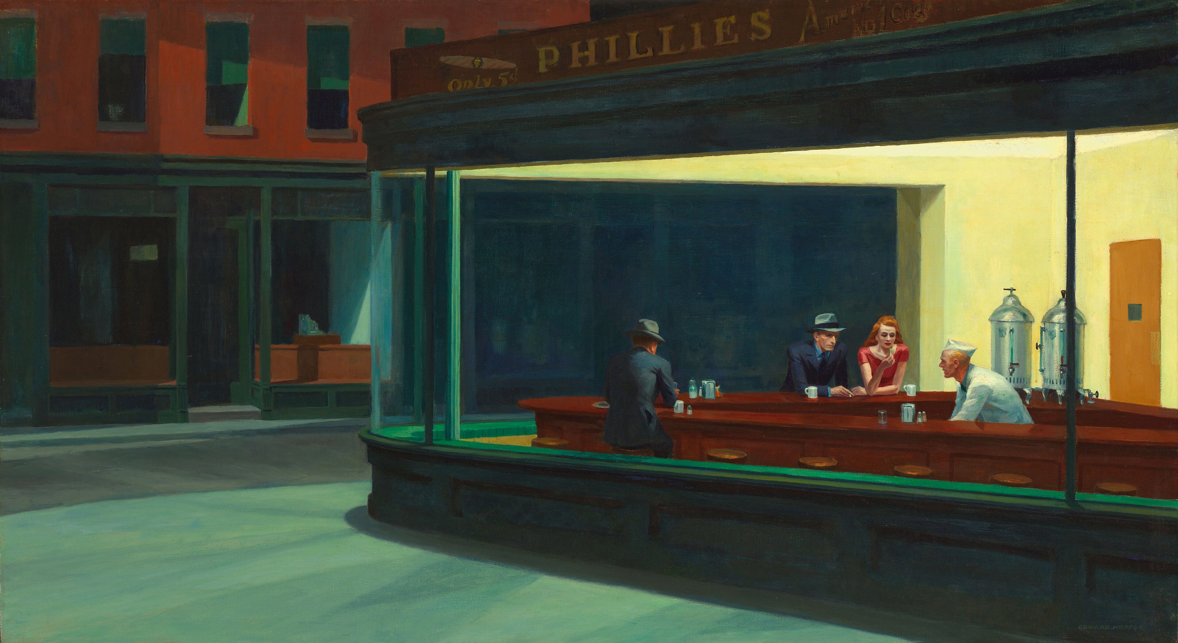
3. Hopper (hopper-style) — light source and figure orientation
Template: hopper-style. One line: the scene. Model renders.
Hopper is the easiest of the three to get backwards. You write "Edward Hopper style" and the output gets the figure right, the emptiness right, the window right — but the atmosphere is missing.
The problem: you gave emotional direction, not physical direction.
Morning Sun (1952) — a woman sits on the bed, back to us. You cannot read her face. The real subject is sunlight on the floorboards and the blank wall beside her — the light has already done all the emotional staging. Nighthawks (1942) — four people in a diner at 2 AM, not talking. The real drama is the color temperature gap between the harsh fluorescent interior and the empty street outside. Automat (1927) — a woman alone in a café, a vast black window in front of her, nothing outside but her own reflection.
Action list to put in the prompt:
- Light source always explicit, never diffuse — single warm source casting hard shadows on the figure
- Figures face away or sideways, never at the viewer
- Large blank walls, never filled — wall / floor / sky should occupy 40%+ of the frame
- A window always implies another world outside
- Warm-cool color temperature gap ≥ 1500K — warm inside, cool outside
A label can't save a generation. "Edward Hopper style" is a direction light, not prompt content.
Direct link: www.ima-read.com/en/bycase?case=hopper-style
The three together: the physics layer of style prompts
Put the three artists in one table and the awkward truth surfaces:
| Artist | The physics layer you actually need to decompose | Discipline analogy |
|---|---|---|
| Van Gogh | Brushstroke direction and rotation, impasto thickness | Brushstroke dynamics |
| Klimt | Gold zoning logic, geometric pattern motifs, gold-leaf texture | Surface histology |
| Hopper | Light source direction, warm-cool color gap, blank-wall ratio | Light geometry |
The word "style" sits on top of three completely different physics problems. Van Gogh is surface dynamics. Klimt is surface histology. Hopper is spatial geometry.
Most "XX style" templates shipping today just slap a name tag on each artist. They never decompose to the action layer — so the output reads as "looks like," not as the artist.
An executable self-check
If you've written "Van Gogh style / Klimt style / Hopper style" and the outputs all look the same, try this self-check:
- Delete the "style of X" line.
- Replace it with the specific actions the artist performs on canvas (5–7 from the three tables above).
- Re-run.
Chances are the output will make you re-meet the artist. Not because the label got more accurate — but because the model is finally getting a physical description it can execute.
- ImaRead: www.ima-read.com/en
- Prompt template library: www.ima-read.com/en/bycase